CONTEXT OF THE PROBLEM
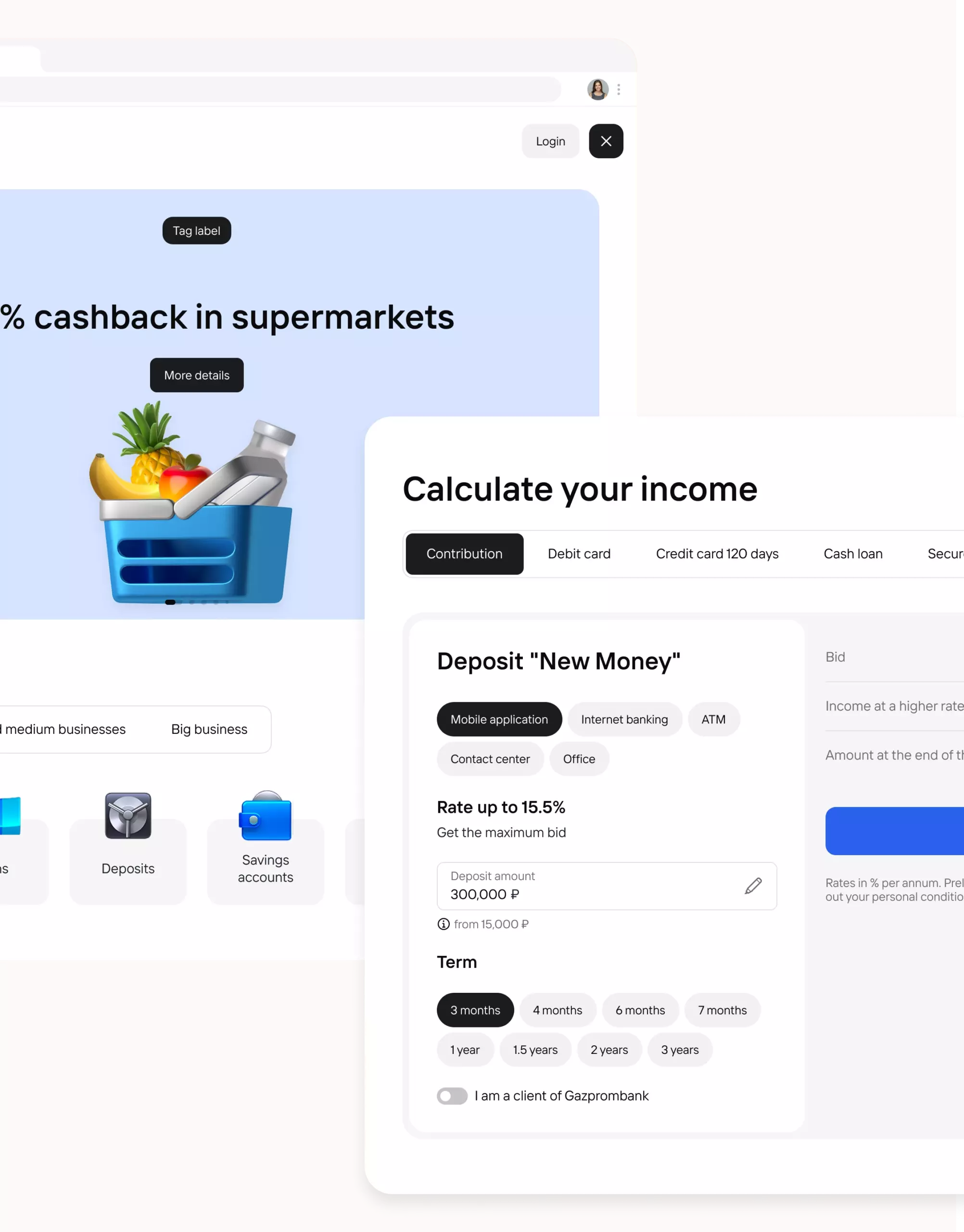
Gazprombank is one of the largest universal banks in Russia, occupying a leading position in the country's financial system. The site is a key entry point for clients.As part of this task, it was necessary to redesign the site with the creation of new components and documentation.
PROBLEMS
- Users do not understand where to start interacting with the product, due to the lack of an obvious main scenario and competing actions on the first screen;
- The user path to target actions contains unnecessary steps, which increases the execution time of the scenario and increases the likelihood of churn;
- The interface is overloaded with information, which makes it difficult for the user to quickly consider the key value of the product and make a decision on further . action;
- User expectations from the product do not match the actual experience, which reduces trust and increases the likelihood of failure.
LIMITATIONS
- The project was developed in a complex product and business environment:
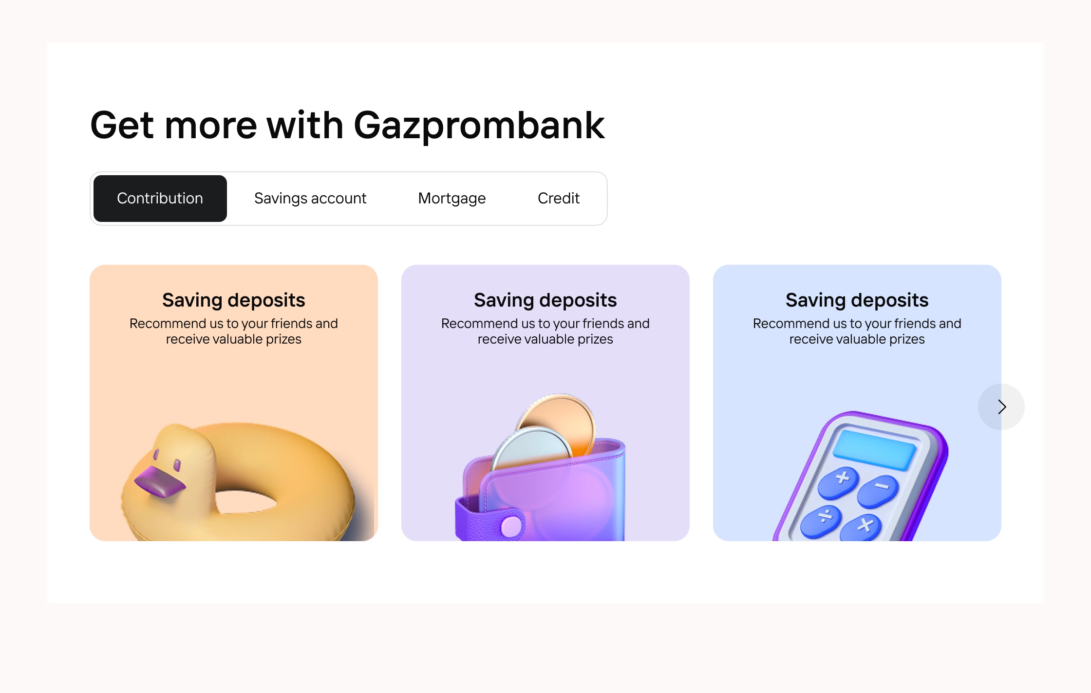
- Several disparate products with different logic and scenarios;
- The need to maintain familiar processes for regular customers;
- Conservative audience with established behavior patterns;
- A large number of business requirements from different departments
OBJECTIVES
- Remove visual noise and establish hierarchy. Clear the interface of outdated decorative elements (extra frames, shadows, gradients), increase the “air” between blocks and make sure that headings and action buttons (CTAs) clearly dominate the secondary text.
- Make the site fully responsive (Mobile First). Stop pinching the desktop version on the mobile screen. Rework the navigation, increase the size of buttons and fonts for comfortable one-handed control from a smartphone.
- Rebuild the visual language. Bring the color palette to modern contrast and abandon outdated graphics in favor of minimalist icons or illustrations.
- Provide instant feedback. Add smooth button hover animations, click effects and clear states to all interactive elements.
- Increase accessibility. Provide sufficient text contrast, visible focus indicators for keyboard navigation, and a logical structure for headings.

MY ROLE
I got involved in the project at an early stage and, together with the art director, brought it to the finale. My area of responsibility was researching existing experience, forming UX hypotheses, designing user scenarios, creating a clickable prototype, designing the entire service and participating in the development of the overall design system of the product.
HYPOTHESES
I analyzed existing Gazprombank products, as well as users and ready-made solutions on the market, which helped me get insights on the basis of which I made several decisions: Hypothesis 1: Increase in conversion to target action
If you increase the visual weight and contrast of key buttons (CTAs), remove distracting visual noise (extra banners, frames) and place forms . in the “warm” zone of the screen, then the percentage of completed target actions will increase by at least 15-20%, because the user will not have to look for the button with his eyes, and the cognitive load when making a decision will decrease.
Hypothesis 2: Increased time on the site (browsing depth)
If you replace “sheets of text” with a visual hierarchy (headings + short paragraphs + bullets), add . service cards instead of boring tables and introduce a smooth animation for the appearance of blocks when scrolling, then users will view 1-2 more pages per visit, because the interface will no longer cause visual fatigue and the desire to close the tab in the first 10 seconds.
Hypothesis 3: Increased trust in the brand and a decrease in support calls
If you unify all input forms (make them visual . understandable, with real-time validation) and add transparent feedback (toasts about success/error, loading animation), then the number of abandoned forms will decrease by 30%, and the number of repeated fills “for mixed up fields” will be halved, because the user will understand what is required of him and see that the system hears him (reduced anxiety during interaction).
KEY SOLUTIONS
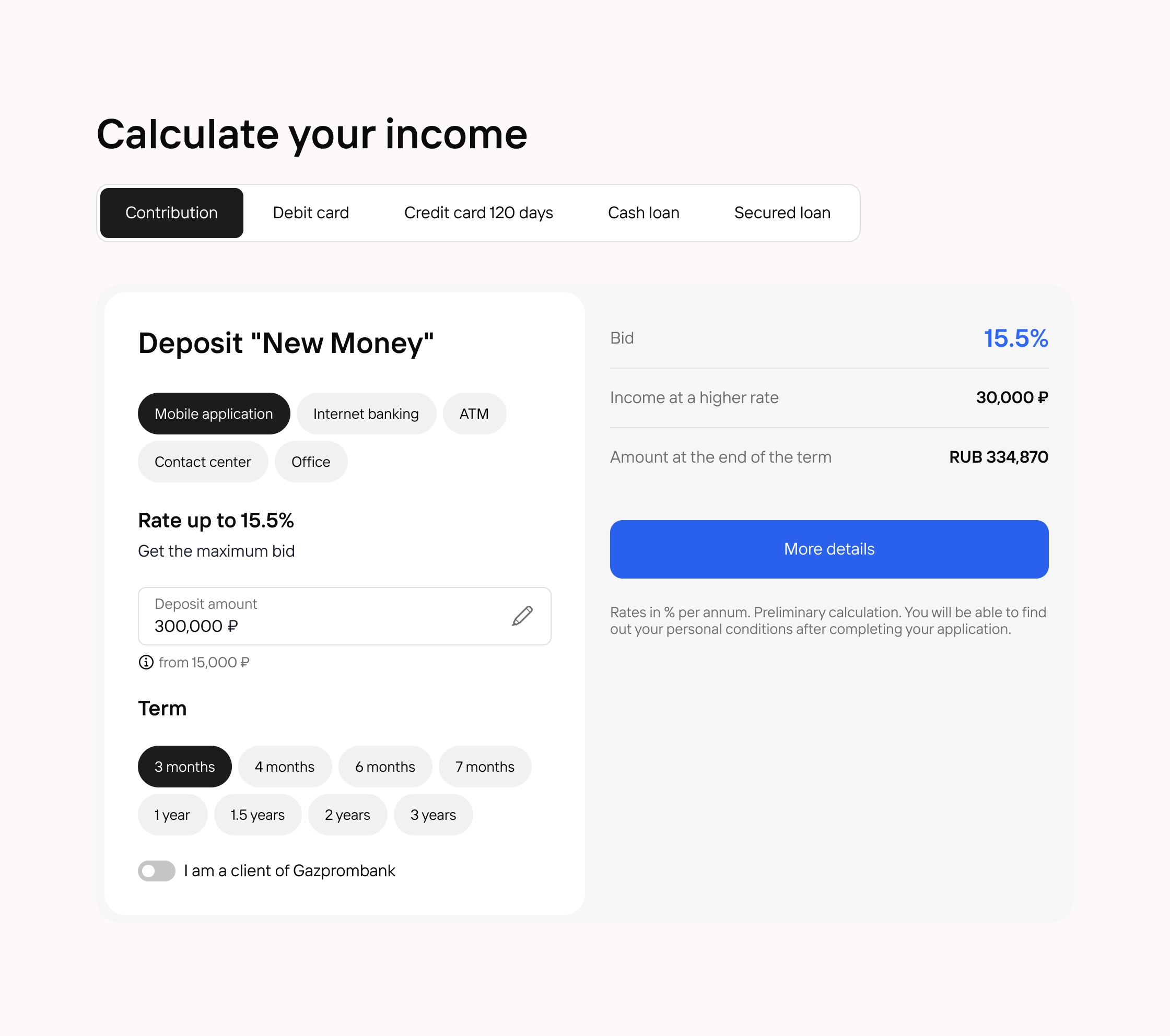
- Design system and UI kit Developed a scalable design system: Documentation of each block;
Unified states and patterns;
Acceleration of the development of new sections.- Introduction of an “accent CTA” and a total cleanup of visual . garbage.
Remove all outdated banners, frames and background textures that do not carry a functional load.
- Rebuild navigation and typography according to the “Mobile First” principle.
Set the base font size for all texts (except small notes) to at least 16px on mobile . devices.
Make all buttons, links and input fields easy to press with a finger (without the risk of touching an adjacent element).
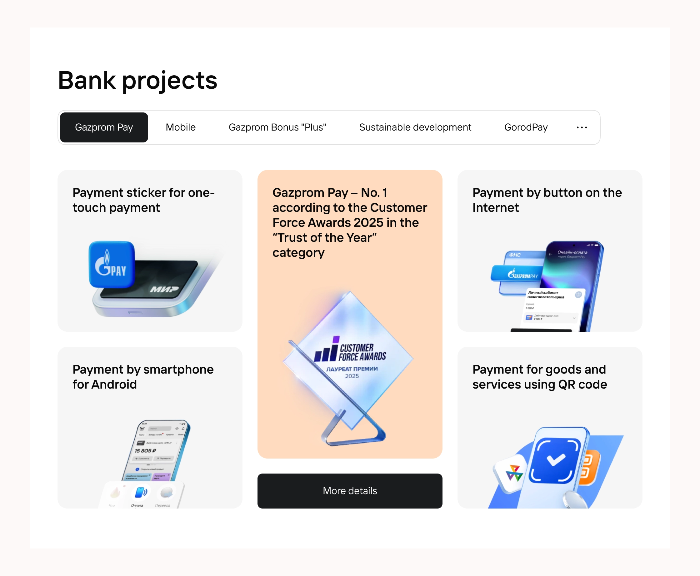
- Restructure content into a scannable format with micro-animation.
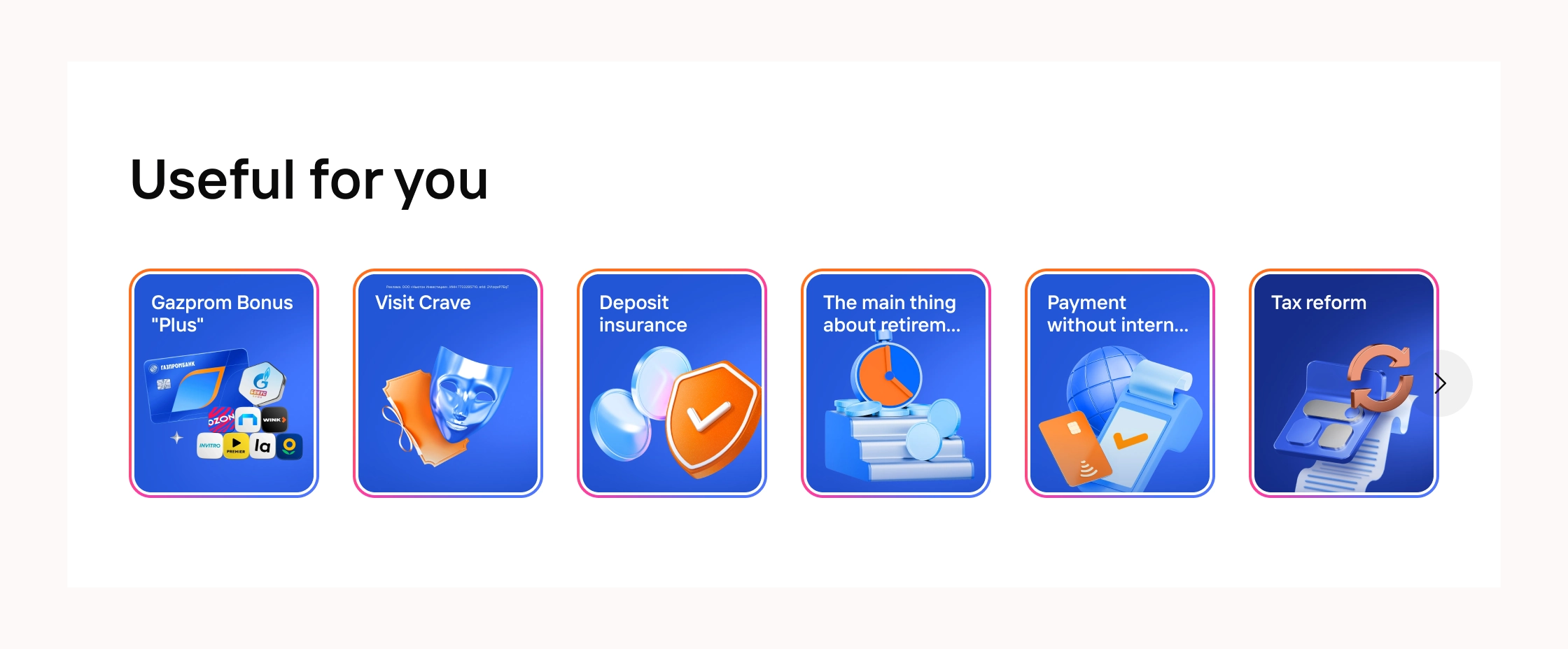
Replace tables (where possible) with cards with visual weight (light shadow or . border).
Add hover animation for blocks to hold attention when scrolling.
- Design a “responsive” form and feedback system.
Unify all input fields to a single style
Add toast notifications (pop-up in the corner) about . successful submission, server error or download so that the user always knows the status of his action.
RESULTS
- Result No. 1 (after strengthening the CTA and clearing the noise)
Increase in conversion to target action by 15–25%.
The percentage of users reaching the submission of the form / clicking on the button will increase
The number of leaving the main screen without interaction will decrease (the “first . click").
Result No. 2 (after Mobile First navigation and fonts)
Reducing the bounce rate on mobile devices by 20–30%.
The number of sessions lasting less than 10 seconds from smartphones will decrease.
The proportion of users who successfully find what they need will increase . menu section on the first try (without accidental clicks).
Result No. 3 (after the scanned structure and animation)
Increased time on the site and viewing depth.
The average session duration will increase by 30–40 seconds.
Users will view 1–2 more pages per . visit (increase in pages per session).
Fast scrolling to the footer without reading the content will be reduced.
Result No. 4 (after responsive forms and feedback)
Reduction in the number of abandoned forms and support requests.
The number of incomplete form submissions will decrease by . 25–35%.
The number of repeated calls to chat/mail will be reduced
Trust in the site will increase (subjectively - less anxiety during interaction).