TASK CONTEXT
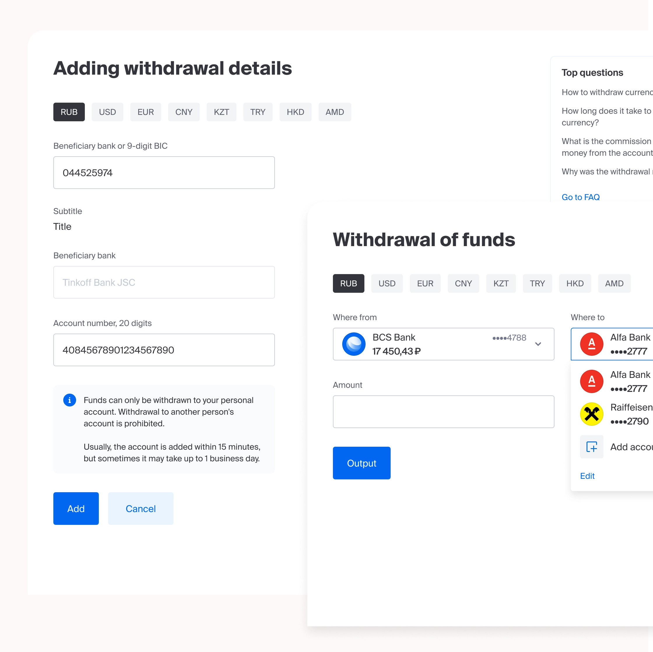
BCS Investments is a unique investment product that holds one of the leading positions in the market. "Factories and Conclusions" is one of the largest projects at BCS, involving a complete redesign of the current product. As part of this task, it was necessary to create new output functionality.
PROBLEMS
Problem No. 1. Outdated and non-intuitive current interface
The existing product has an outdated architecture and visual design that does not meet modern UX/UI standards. Users find it difficult to understand the current withdrawal process — key actions are scattered across different screens, and important information (fees, timelines, limits) is either hidden or presented in an unreadable format.
Problem #2. Lack of a unified workflow for different withdrawal methods
The BCS platform supports a variety of withdrawal methods (bank cards, current accounts, brokerage accounts, various banks), but each of them is implemented in its own way, with a different number of steps and logic. The user is forced to relearn for each method, which leads to errors, abandoned applications, and support requests.
Problem No. 3. Lack of transparency regarding fees, limits, and processing times
The user does not see clear information about what fee will be charged, how long the withdrawal will take, and what limits (minimum, maximum, daily) are in effect. Often, the commission or limit is only revealed after filling out a form or at the final step, which causes irritation and distrust in the product.
Problem #4. A complex and long path to the target action
The withdrawal process requires the user to perform too many actions and navigate between screens, as well as re-enter data already known to the system (for example, card or account details). There is no option to save frequently used details or repeat output using a template, which increases operation time and cognitive load.

LIMITATIONS
- Strict financial regulation and security requirements
The withdrawal functionality at the brokerage company (BCS) is subject to strict oversight by the Central Bank and other regulators. Design solutions must not violate requirements regarding customer identification, anti-fraud checks, and mandatory delays for withdrawals to specific accounts. It is impossible to remove or shorten certain mandatory steps (for example, SMS confirmation or entering a code from an app), even if they increase the user journey.
- Integration with a multitude of legacy systems and external banks
The BCS backend architecture historically consists of many outdated systems that are responsible for different types of withdrawals (to cards, to current accounts, to brokerage accounts of various banks). Design cannot change the logic of how these systems work — it can only adapt the interface to their current APIs. It is impossible to create a single universal scenario if technically different output methods are processed in completely different ways on the server side.
- Maintaining the BCS corporate design system
All new screens and components must strictly comply with the existing global BCS design system (UI Kit, color scheme, typography, interaction patterns). The introduction of new non-standard controls, animations, or layouts that are not present in the component library is not permitted without prior approval and the expansion of the design system itself. This limits the freedom to pursue innovative UI solutions.
GOALS
- Unification of the scenario for all withdrawal methods
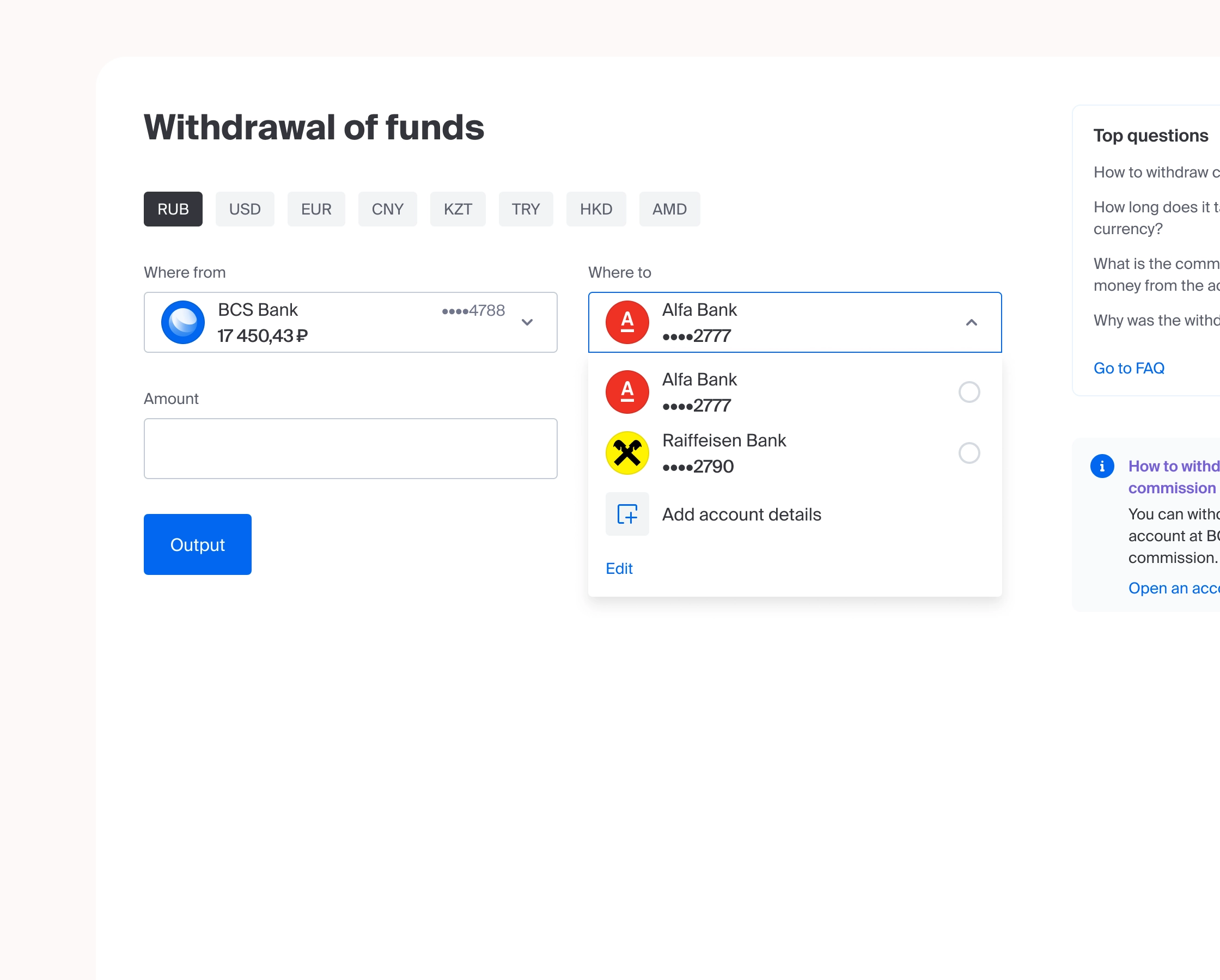
Create a unified, clear, and predictable user journey for all types of withdrawals (to bank cards, current accounts, and brokerage accounts of other banks). Regardless of the chosen method, the number of steps, the logic of filling out the form, and the visual design must be identical so that the user does not have to relearn how to use it.
- Full transparency of fees, limits, and processing times before starting the transaction
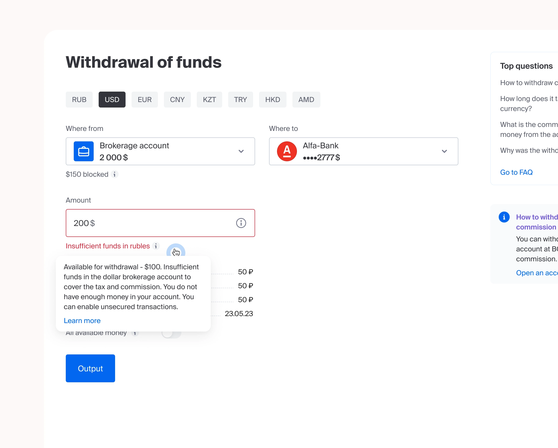
Ensure that all financial information (fee amount, minimum and maximum withdrawal amounts, daily and monthly limits, and processing time) is displayed on the very first withdrawal screen — before the user begins filling out the form. The user must see how much the transaction will cost them before deciding to proceed with it.
- Reducing the number of user steps and actions
Reduce the path to the target action (successful withdrawal of funds) by at least 30–40% compared to the current version. This is achieved by: pre-filling already known details, saving frequently used withdrawal templates, eliminating unnecessary confirmation screens, and grouping all necessary information on a single screen.
- Reducing the number of abandoned requests and support inquiries
Reduce the percentage of users who started the withdrawal process but did not complete it, as well as decrease the number of inquiries to the contact center regarding fees, timelines, limits, and errors when entering details. The target reduction is at least 25% for each of these indicators through a clear, predictable, and transparent interface.
MY ROLE
In this project, I acted as a Product Designer. My tasks included:
Analysis: auditing current functionality, identifying user pain points, and gathering constraints (regulatory, technical, corporate).
Strategy: formulating goals, hypotheses, and success criteria for the redesign.
Design: creating information architecture, designing a unified workflow for all withdrawal methods, and developing prototypes and the final UI.
Communication: presenting solutions to stakeholders and technical specialists, while accounting for legacy system and security requirements.

HYPOTHESES
Hypothesis No. 1. Unification of scenarios for different withdrawal methods
If all existing withdrawal methods (to cards, to bank accounts, to brokerage accounts) are brought into a single visual and logical scenario with the same number of steps, the number of errors during completion will decrease by 30–40%, because the user will no longer have to relearn and memorize different rules for each type of withdrawal — the interface becomes predictable.
Hypothesis No. 2. Transparency of fees and limits before initiating a transfer
If all information regarding fees, limits (minimum, maximum, daily), and processing times is displayed on the very first withdrawal screen—before the user starts filling out the form—the number of abandoned requests at the confirmation stage will decrease by 25–35%, because the user will not encounter "surprises" in the form of unexpected fees at the final step and can decide on the feasibility of the transaction immediately.
Hypothesis No. 3. Saving templates and frequently used payment details
If we add functionality for saving frequently used payment details (payout templates) and automatically pre-filling data already known to the system (card, account), the average form completion time will decrease by 40–50%, and the number of repeat payouts to the same details will increase, because the user does not need to re-enter long card and account numbers every time — it is enough to select a template with one click.
Hypothesis No. 4. Grouping all information on a single screen
If you combine all the steps of the withdrawal process (selecting the method, entering the amount, confirmation, result) into one long, scrollable screen instead of several sequential screens with transitions, the percentage of successfully completed withdrawals will increase by 15–20%. This is because it reduces cognitive load and the risk of getting lost between screens, and the user sees the full picture of the operation, including the final amount to be received and the commission.

KEY SOLUTIONS
Solution No. 1. Unified master scenario for all withdrawal methods
Essence of the solution: Design a universal master (step-by-step or single-page scenario) that works identically for all types of withdrawals — to bank cards, current accounts, and brokerage accounts of other banks.
Solution No. 2. "Important to know" block on the first screen
Essence of the solution: Place an information block with all financial information about the transaction on the very first output screen (above the form).
Solution No. 3. "My Templates" functionality and pre-filling
Essence of the solution: Add the ability to save frequently used details as templates and automatically fill in data already known to the system.
RESULTS
Result No. 1. Unification and predictability of the process
All withdrawal methods (to cards, accounts, brokerage accounts) now follow a single scenario with the same number of steps.
Reduction in the number of errors during completion by 30–40% (the user does not get confused by different logic for different withdrawal methods).
Faster mastery of functionality — new users do not need to learn separate rules for each type of withdrawal.
Unified visual language — all forms and cards look the same, which increases trust in the product.
Result No. 2. Transparency of financial terms
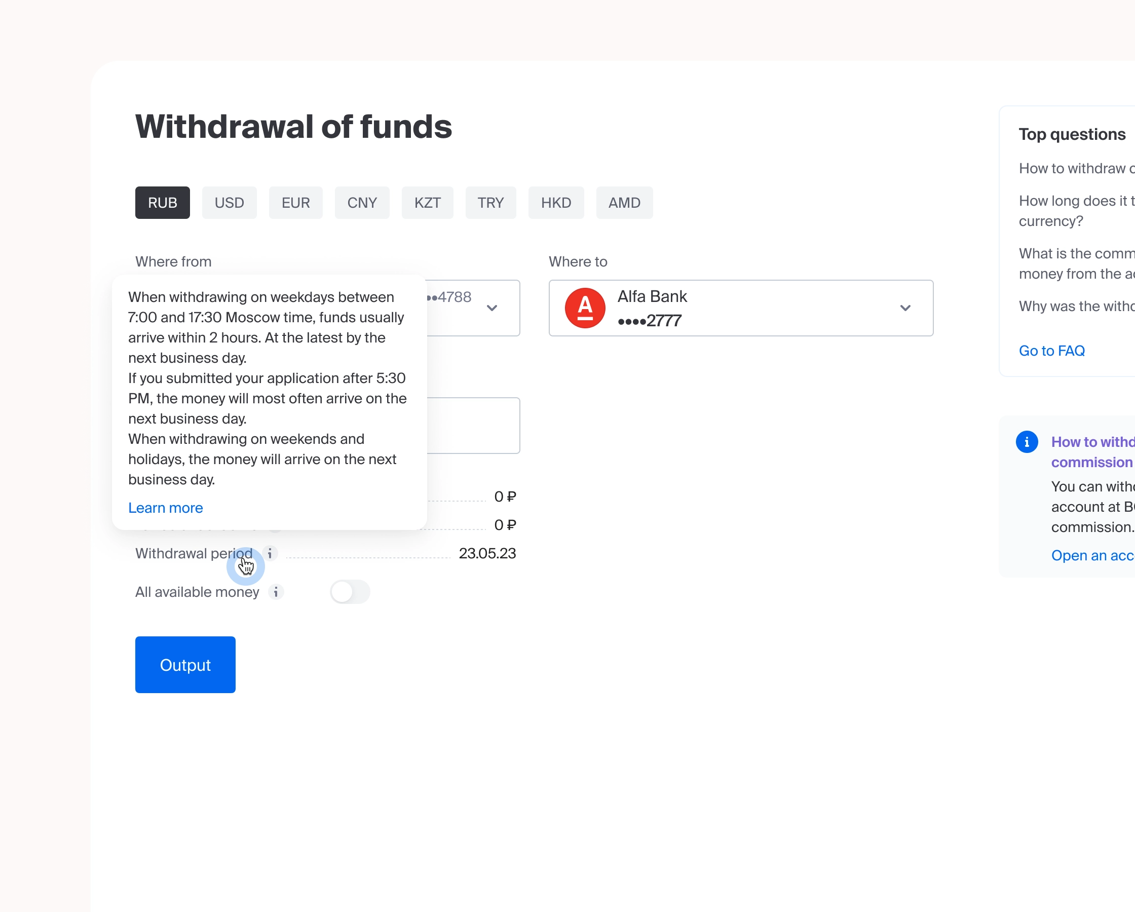
Information about fees, limits, and processing times is displayed before filling out the form and is updated dynamically.
Reduction in the number of abandoned applications at the confirmation stage by 25–35% (the user does not encounter unexpected fees at the final step).
Reduction in support inquiries regarding fees and timelines by 40–50% (all necessary information is already available in the interface).
Increased trust in the product — the user understands the full cost of the transaction before completing it.
Result #3. Speed and convenience of recurring transactions
The "My Templates" feature and automatic pre-filling of details reduce form-filling time.
Reduction in average form-filling time by 40–50% (one-click template selection instead of manually entering 16–20 card digits).
Increase in the number of repeat withdrawals to the same details due to the low barrier to entry for recurring transactions.
Reduction of errors during manual entry of details—to practically zero for template-based transactions.
Final business result
Increased customer loyalty to BCS brokerage services and reduced operational costs. Users withdraw funds faster and with fewer errors, contact support for clarification less frequently, and transparent terms build trust in the company. The redesign of one of BCS's largest products led to a measurable improvement in key metrics: transaction completion rates, scenario execution time, and the number of errors and support requests.