

TASK CONTEXT
The betting project Major Leagues Market is among the top betting projects in the USA. Its uniqueness lies in the fact that the user can not only bet on sports teams in various sports disciplines, but at the same time buy shares of teams and sports associations. Thus, MLM is a hybrid of betting and investment.
PROBLEMS
- Difficulty in understanding hybrid mechanics for new users
Users are accustomed to classic betting (placed a bet — won or lost) and classic investments (bought stocks — hold or sell). The hybrid MLM mechanic, where betting and purchasing team shares exist within a single product, creates cognitive dissonance. A new user does not understand the difference between "betting on a team's victory" and "buying shares of that same team," how returns are calculated, and what risk they are taking on in each scenario.
- Lack of clear visual differentiation between betting and investing
The interface does not visually separate two fundamentally different actions: placing a bet (short-term risk with a quick result) and buying team shares (long-term investment). A user might accidentally buy shares, thinking they are placing a regular bet, or conversely, place a bet while planning for long-term ownership. The absence of color, iconographic, and text markers leads to errors and distrust in the product.
- Information overload and mixing of data
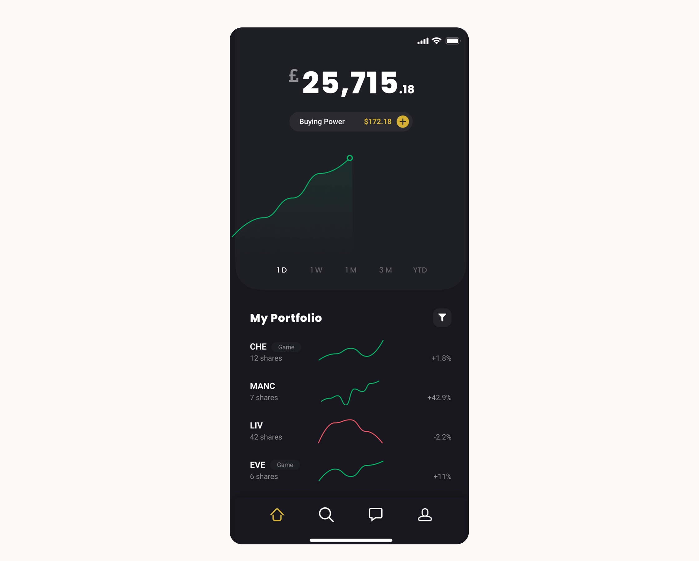
Two types of data are mixed in one interface: betting (odds, betting limits, match outcomes) and investment (stock price, dividends, P/E, historical yield, trading volumes). The user cannot quickly find the necessary information — their eyes wander, and key metrics are lost in a stream of disparate data. This leads to erroneous decisions and abandoned scenarios.
- Conflict of planning horizons and risk profiles
Betting involves a short horizon (minutes, hours, days) and high risk. Investments — long-term horizon (months, years) and moderate risk. The MLM interface is not adapted to different user scenarios and does not suggest to the user which action is most appropriate at any given moment. An investor by nature may accidentally end up in a high-risk bet, while a bettor may "freeze" money in stocks for a year without realizing it. The lack of personalization and contextual prompts leads to user dissatisfaction and churn.

LIMITATIONS
- Strict regulatory and legal separation of betting and investments
In the USA, betting (sports wagering) and investments (stock purchases) are regulated by different bodies and laws. Betting is subject to the laws of individual states and gaming commissions, while investments are regulated by the SEC (Securities and Exchange Commission). The MLM interface must clearly distinguish between these two types of operations, inform the user about the differences in risks and taxation, and obtain separate licenses. Design cannot "mix" these entities to the point of indistinguishability — this is a direct violation of regulatory requirements.
- Technical integration with two different backend systems
The betting part of the product runs on one technology platform (odds, bet settlement, payouts), while the investment part runs on another (stock market data, buy/sell orders, dividends). These systems may have different response speeds, different request processing logic, and different data formats. Design solutions must take into account the technical impossibility of consolidating certain data in real time (for example, the instant display of a balance after a bet and after a stock purchase may update with different delays).
- Maintaining brand recognition for two different user audiences
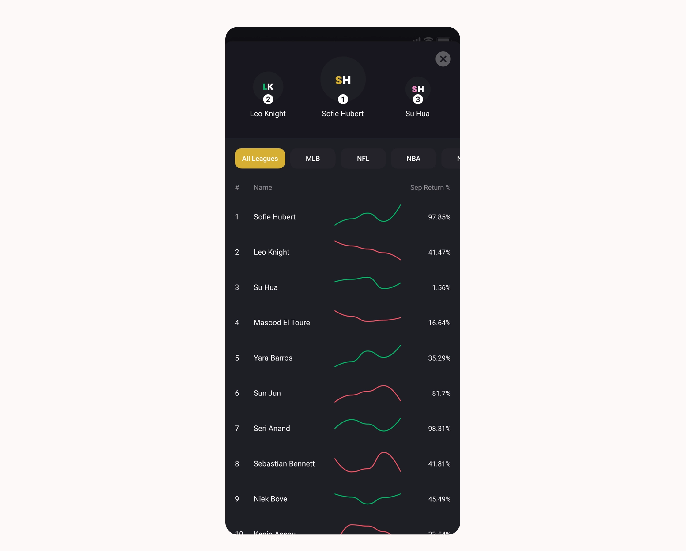
The MLM product simultaneously serves two different audiences with opposing habits and expectations: bettors (accustomed to bright odds, fast actions, and a gamified interface tone) and investors (accustomed to strict charts, analytics, tables, and a conservative visual style). The design cannot shift radically in either direction without losing the second audience. It is necessary to find a balanced visual solution that will be comfortable and recognizable for both groups — this limits the choice of color schemes, typography, and interaction patterns.

OBJECTIVES
- Create a clear and intuitive differentiation between betting and investing
Ensure instant visual and textual distinction between the two types of operations — betting and investing — at all stages of interaction (selection, event card, confirmation form, transaction history). The user must understand at a glance what they are doing: making a high-risk short-term bet or purchasing stocks with a long-term horizon. Differentiation must be implemented through color codes, icons, text labels, and a different set of displayed metrics.
- Develop an information architecture that separates but does not confuse data
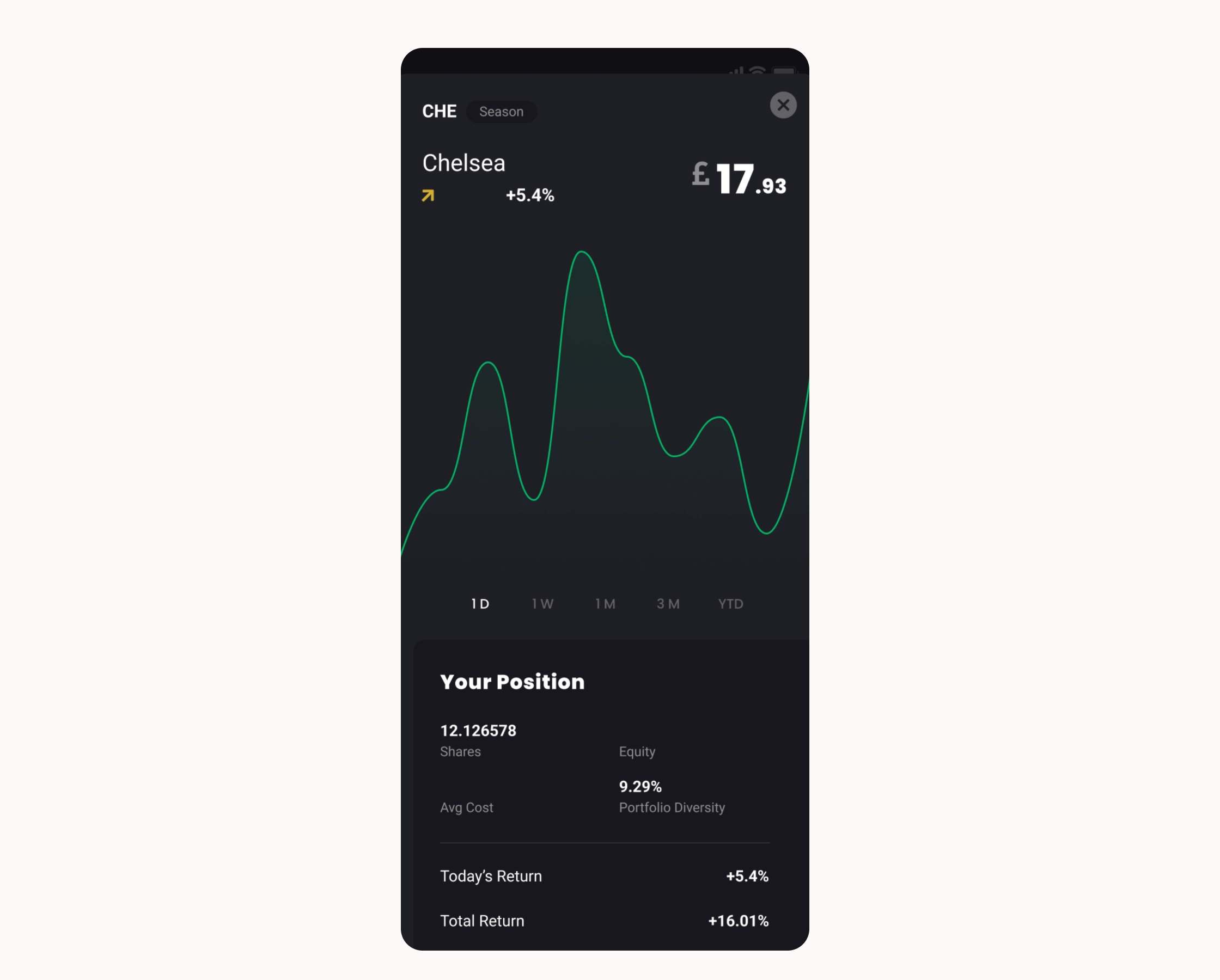
Create a screen structure where betting and investment data are not mixed into a single "hodgepodge," but at the same time do not require the user to constantly switch between sections. The key goal is to present information in two independent blocks on a single screen (for example, a team card): "Bets" (odds, outcomes, limits) and "Stocks" (price, dividends, chart, volumes). The user chooses which block they are interested in, without getting lost in a stream of heterogeneous data.
- Take into account different planning horizons and risk profiles
Adapt the interface for two types of user behavior: for bettors — an emphasis on quick actions, live odds, and instant confirmation; for investors — an emphasis on analytics, historical charts, dividend yield, and long-term holding. The goal is not to create a "one-size-fits-all interface," but to build a customizable space where the user can switch between modes (betting/investing) or receive contextual prompts based on their action history and risk profile.

MY ROLE
In this project, I served as the lead UX/UI designer. My tasks included:
Research and analysis: studying the behavior of two audiences (bettors and investors), identifying conflicts in their needs, and analyzing regulatory constraints (SEC and gambling commissions).
Information architecture: creating a structure that separates betting and investing without forcing the user to constantly switch between sections.
Visual differentiation: developing color codes, icons, and patterns to instantly distinguish between placing a bet and buying shares.
Scenario design: creating two parallel user journeys (for quick bets and long-term investments) within a single product.
Communication: defending decisions to stakeholders, taking into account legal and technical constraints.
HYPOTHESES
Hypothesis No. 1. Visual differentiation of betting and investments
If a clear visual system for distinguishing between the two types of operations is introduced (betting — orange/red accents with a lightning icon, investments — blue/green accents with a chart/shield icon), the number of erroneous actions (the user bought stocks instead of placing a bet and vice versa) will decrease by 60–70%, because the color and icon become instant triggers, perceived at a pre-conscious level, without the need to read the text.
Hypothesis No. 2. Separate information architecture within the team card
If two independent horizontal blocks ("Bets" and "Stocks") are placed on the team card with the ability to collapse/expand each, rather than mixing odds and stock prices in a single list, the time required to find the necessary information will be reduced by 40–50%, because the bettor user will immediately look at the "Bets" block, and the investor user — at the "Stocks" block, without being distracted by irrelevant data.
Hypothesis No. 3. Adapting the interface to user behavior
If you analyze a user's action history and offer them a contextual default mode (betting for those who place bets more often; investments for those who buy stocks more often), with the option of manual switching, then the depth of engagement and the number of completed transactions will increase by 20–30%, because the user does not spend cognitive resources on filtering irrelevant information and immediately enters a familiar context.
KEY SOLUTIONS
- Modular team card with independent blocks
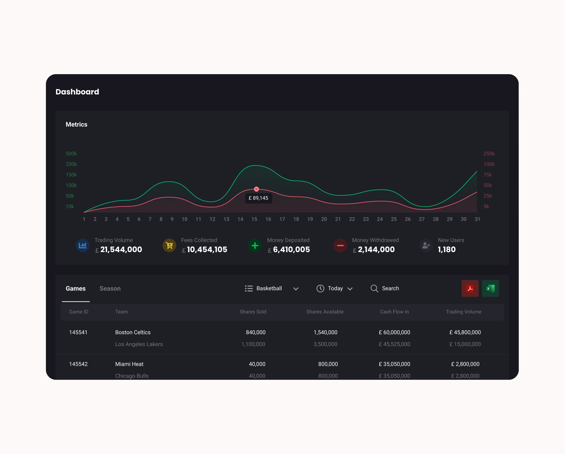
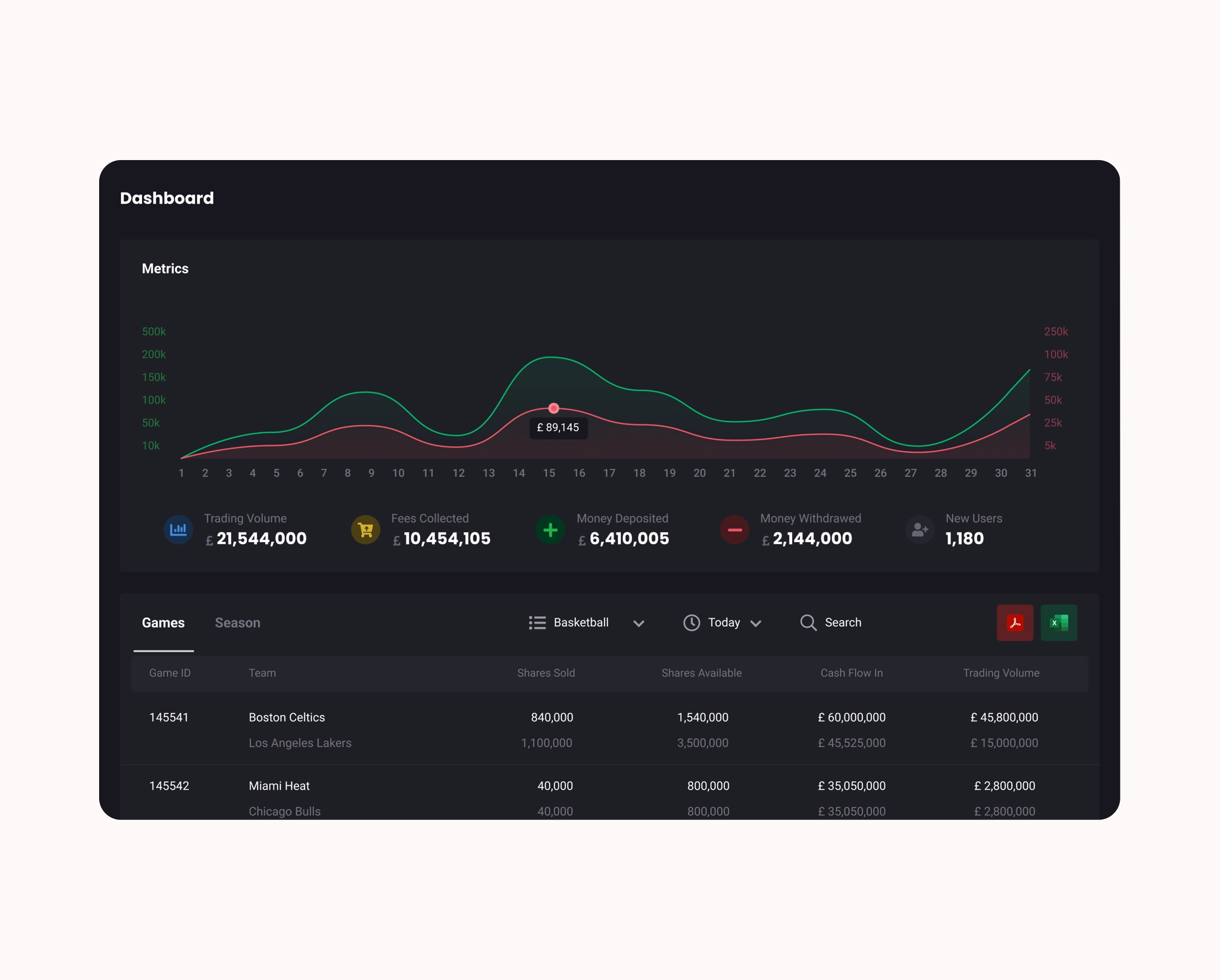
Essence of the solution: Redesign the team card (the product's main screen) into a modular structure where the "Bets" and "Promotions" blocks exist in parallel and independently.
- Adaptive "Bettor / Investor" mode
Essence of the solution: Add a mode switcher in the app header or user profile that changes the priority of displayed information across all screens.
- Unified yet differentiated transaction confirmation wizard
Essence of the solution: Create a confirmation screen with a unified structure that changes visually and in content depending on the type of operation (bet or investment), while remaining predictable for the user.
- Contextual onboarding for new users
Essence of the solution: Create a two-path onboarding (introductory tour) that, depending on the user's choice, explains either the betting mechanics, the investment mechanics, or both options, without information overload.

RESULTS
Result No. 1. Reduction of erroneous actions when selecting the operation type
The number of user errors (when a bet was placed instead of an investment, or an investment instead of a bet) decreased by 60–70%.
Reason: the implemented dual visual coding (color + icon) makes the difference between operation types obvious at a pre-conscious level.
Additional effect: a decrease in the number of support requests with questions like "Why did I buy stocks when I wanted to place a bet?" or "How do I cancel an erroneous operation?".
Result No. 2. Accelerating the search for necessary information
The time a user spends searching for relevant data (odds or stock prices) has decreased by 40–50%.
Reason: the modular team card with independent "Bets" and "Stocks" blocks allows a bettor to look at one block immediately, and an investor at the other, without being distracted by irrelevant data.
Additional effect: reduced cognitive load and visual fatigue due to the absence of a "mixed vinaigrette" of heterogeneous metrics.
Result No. 3. Growth in completed operations and page depth
The number of successfully completed operations (bets and stock purchases) increased by 20–30%, and page depth (the number of team cards viewed per session) increased by 25–35%.
Reason: the adaptive "Bettor / Investor" mode shows the user the most relevant content first, shortening the path to the target action and reducing the number of abandoned scenarios.
Additional effect: interface personalization increases user loyalty and retention, especially among those who actively use both types of operations.
Result No. 4. Lowering the cognitive entry threshold for new users
The number of new users who successfully completed their first transaction (placing a bet or purchasing shares) within the first 24 hours after registration increased by 35–45%.
Reason: contextual two-path onboarding explains to the user only what they are interested in, without information overload, and the demo mode allows for a safe introduction to the mechanics.
Additional effect: a decrease in the percentage of "dead" registrations (users who registered but did nothing) and a reduction in the number of support queries from beginners.
Final business result
Strengthening MLM's position as a top hybrid product in the US market. The growth of key metrics (erroneous actions ↓60–70%, information search time ↓40–50%, completed operations ↑20–30%, newcomers with their first operation ↑35–45%) led to an increase in NPS (Net Promoter Score), a reduction in user churn, and an increase in the average check, as users began to more confidently utilize both types of operations—both betting and investments.